
Happy Monday friends! How was your weekend? Ours was lazy, but it was great! Today II am finally sharing Mason's 1st birthday invitation with you, as well as how to create the same obre effect yourself.
For me, the basis of any good party is the invitation. It should set the overall tone for the event and give your guests a little sneak peek of what's to come! I knew from the beginning I wanted some sort of ombre effect on the card. First I tried painting different shades of blue, but since I don't know how to watercolor, it didn't turn out so fabulous (see below).

That's when I saw this post from Say Yes to Hoboken on how to dip dye tags, I thought it would be a great way to get the effect I was looking to achieve on the invitation. I, however, had to change some things up from her tutorial because: 1. I didn't have dye of any sort and I wasn't going to buy any, and 2. I didn't have a can/ cup/ vase or anything tall enough and wide enough to dip the 5x7" invitation. Below is my take on the dip dying process.
You will need:

A large enough baking dish to fit your paper, watercolors (not the dry kiddie kind), a paint brush watercolor paper, a rag, and of course water. (ignore the heart cookie cutters that was for another project).

Mix up your color in the baking dish with the water. Pour in enough water so it's about 1/4" deep. Add more paint depending on how dark you want your paper to get (you can also add more later if it isn't dark enough). Mix the paint with a paint bush to make sure there are no globs of paint on the bottom on the dish.

You will create the lightest color first. Dip your paper to the point where you want the color to start and giggle slightly to avoid a harsh line. Leave it in for just a few seconds and pull it out of the water. If it is the color you desire the dab the bottom on the rag to collect any pooling color and let it sit to dry. If you want that section darker, then put in back in the color for a few more seconds and let it dry.
When it's completely dry repete the process, but don't dip the paper in as far. This time leave the paper in the color a little longer. Continue this process till you have all the layers of color you desire. ** be sure to mix the color with your bush before each layer to avoid the globs of color on the bottom of the dish. If you don't you will end up with very thick, uneven layers of paint.


This is what my paper looked like when I was half done. Notice the little dark spots on the side? Those are globs that I missed!
That is you can dip dye an invitation!


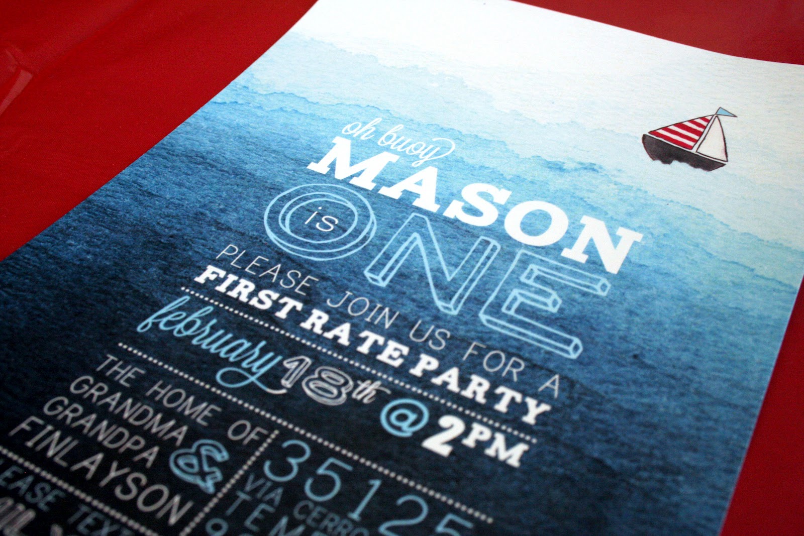
I know what you are going to ask me, "You dip dyed every invitation?" No I did not! I dip dyed 1 invitation and scanned it in. I also painted a few sailboats to scan in so I wouldn't ruin my dip dying. After I scanned everything, I placed the in Photoshop and added my text.

What do you think? Will you try the dip dying effect on any of your projects?
**UPDATE- TO PURCHASE THE NAUTICAL INVITATION CLICK HERE!**
it really was an adorable invite.
ReplyDeleteThank you! I'm glad you liked it!
ReplyDeleteOMG, I am in love with this invitation! You did a wonderful job. I've been searching online for months now to try to find a nautical invitation that would be stylish, unique, and cute enough for a baby's first birthday party, and this is IT! Can't wait to try this myself. Thanks for sharing.
ReplyDeleteI love love love this invitation! I was hoping you could tell me what typefaces you used- specifically for the "one" and "February"
ReplyDeleteThanks!!!
I LOVE THIS and i was also wondering the fonts and how you worked on this in photoshop- I am new to photoshop and would love info- THANKS
ReplyDeleteThis comment has been removed by the author.
ReplyDeleteHi! I love this invitation! I want to purchase, but the link above is no longer working. HELP!
ReplyDeletekat.efenio@gmail.com